The Charlotte Letter
MEDIUM
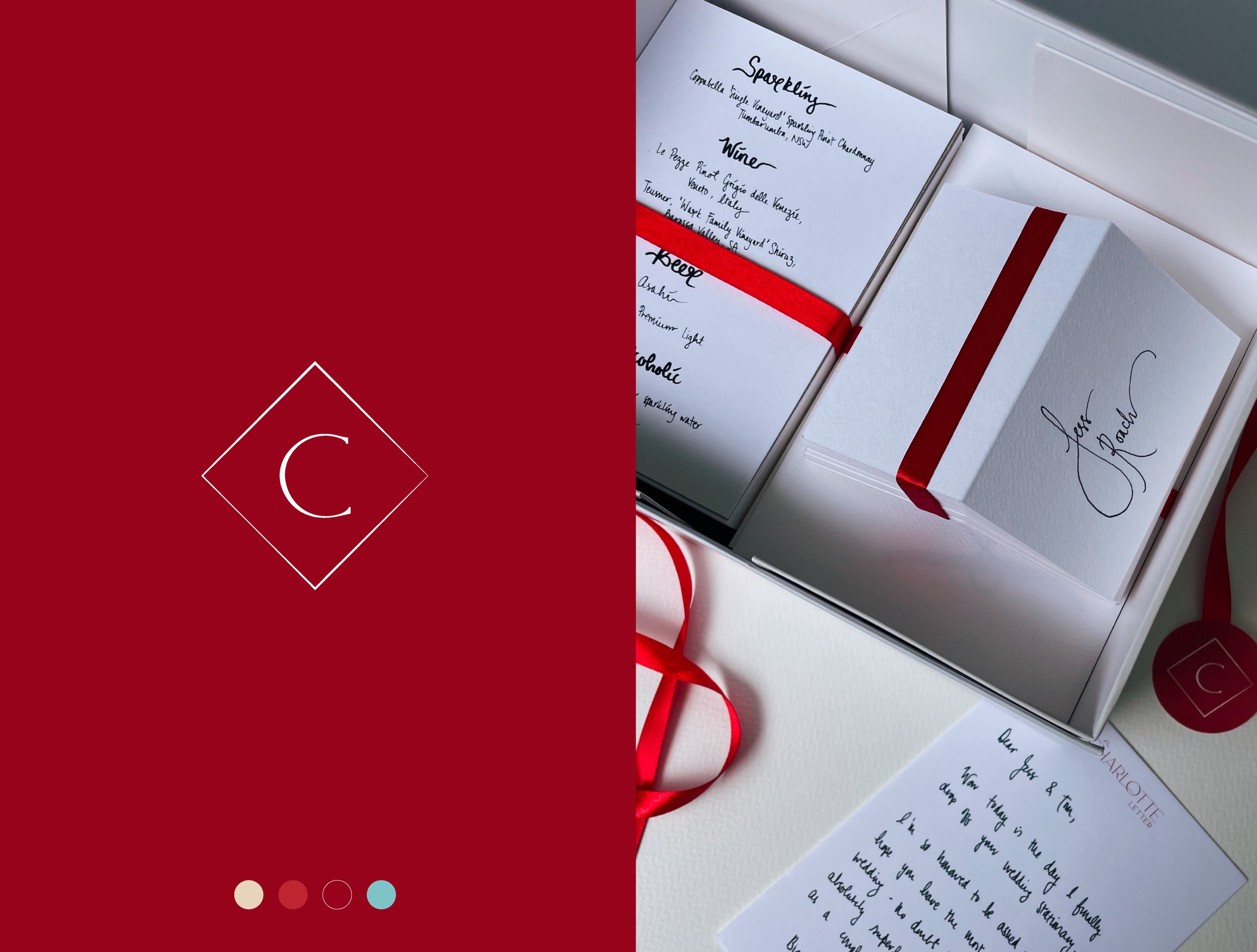
Visual Identity + Collateral
BRIEF
Modern calligraphy studio with a side of sin
DESIGN SOLUTION
As everything looks better in handwriting, The Charlotte Letter’s logo and brand mark combines the old and the new - originally drawing inspiration from traditional type faces and matching that with modern hand type.
Deep reds and rich creams bring the brand alive with an unexpected pop of turquoise to inject youth and vibrancy.